
Have you ever considered how the colors in your workplace affect employee productivity and mood? Colors impact every aspect of our lives, which is also true of the spaces in which we work. Some colors spark joy and excitement, while others calm the senses or stress us out. The colors you choose can make all the difference between a boring, dull work environment and an inspiring, motivating one.
A University of Texas study found that different colors elicit reactions in the brain that can impact mood and productivity in workers. The study suggests that bland colors such as beige, white, and gray can induce feelings of sadness or depression, especially for women who tend to respond better to brighter colors. On the other hand, the study noted that men tend to be more sensitive to bold colors like orange and purple, which evoked feelings of depression and gloom.
So how can you balance the two and incorporate color psychology into your workplace that inspires, motivates, and enhances productivity for everyone? Here are some commercial office color schemes to consider using on your walls and in fabrics, furnishings, and decor.
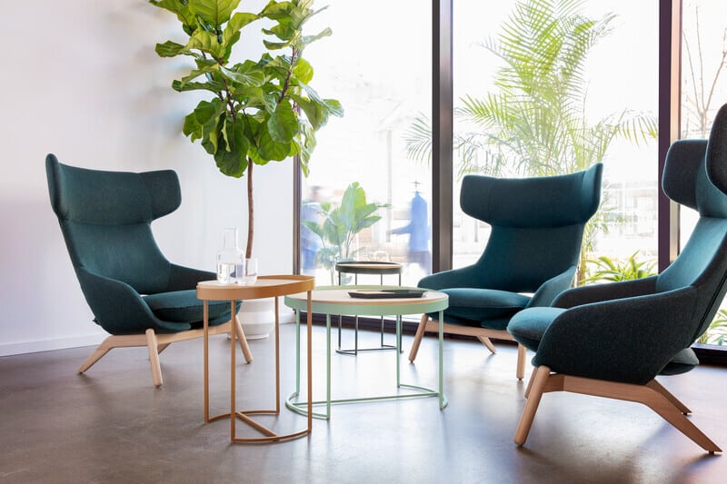
Relaxing Blues and Greens
Cool colors like blue and green have a calming, soothing effect. Blue, in particular, creates a sense of ease and stability and promotes concentration and communication. This makes it a great option for administrative offices or workplaces where detail-oriented, analytical tasks are the norm. It’s also well-received by all genders, making it a popular hue for common spaces such as office cafes and conference rooms. Just as it does in nature, green exudes balance and rejuvenation. Its soothing quality can help ease stress and improve focus. Rich green works well for financial or healthcare offices, break rooms and front lobbies. You can easily add more green to commercial office color schemes with plants! According to the University of Texas study, combining blue and green improved productivity much more than bolder color schemes. Therefore it’s no surprise that teal (a mixture of blue and green) is excellent for stimulating the mind. Use it as an accent color on a wall for a pop of color and motivation.
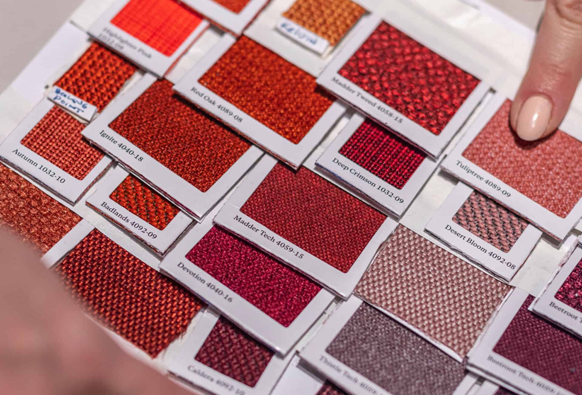
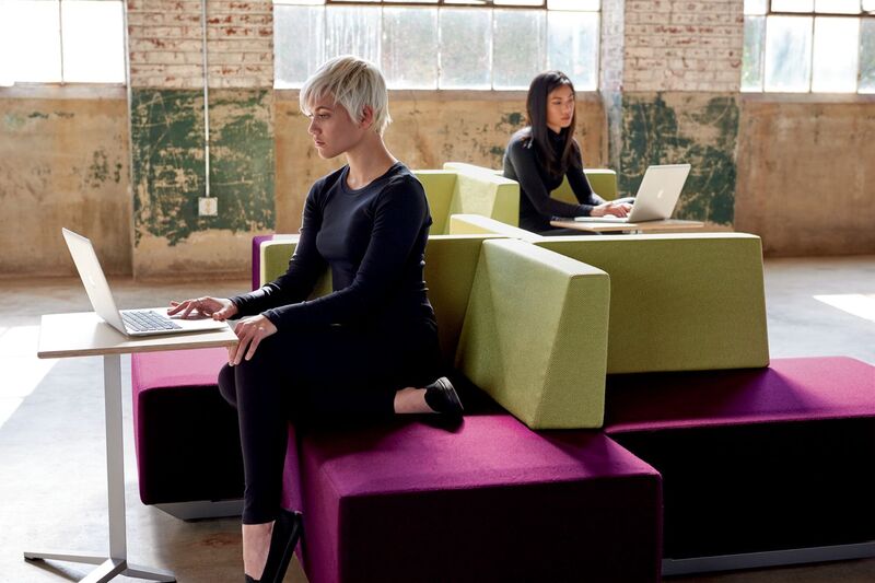
Invigorating Yellows, Reds, and Oranges
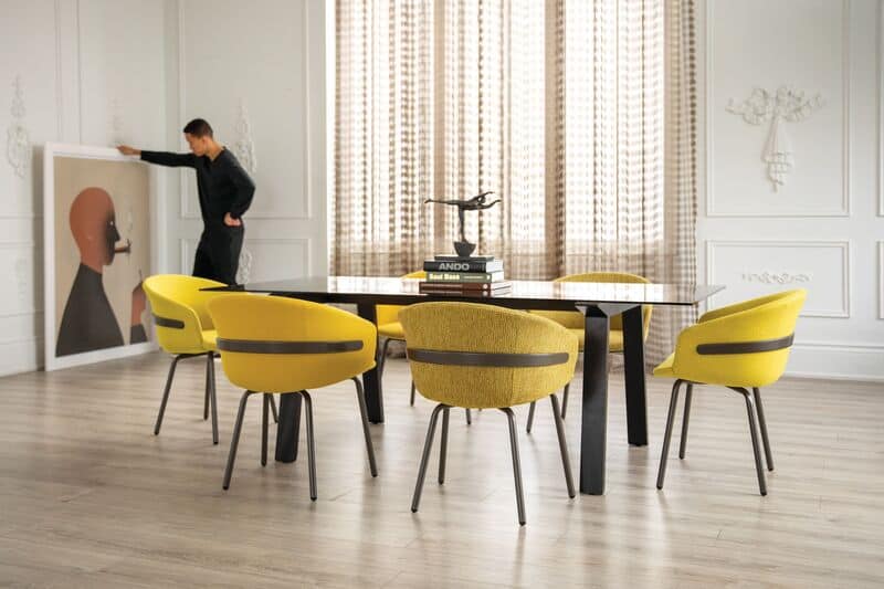
Yellow is an uplifting color that boosts creativity, confidence, and mood, putting employees in a great disposition for productivity. It’s the perfect hue for creative workplaces requiring collaboration, innovation, and brainstorming. It works best as an accent color with neutrals such as white or brown. Find a vibrant shade that adds a positive vibe to the office and is easy to decorate without being too flashy. Red is also an energizing color that promotes a sense of urgency and alertness, but it should be used sparingly. While appropriate in small doses in offices, such as sales, that thrive on high energy, it can trigger a fight or flight response that hinders productivity. As a mix of yellow and red, orange is more palatable and can evoke enthusiasm, endurance, and activity in an office that needs a pick-me-up. But it can be intense for some, so it’s best to use it as an accent.
Perceptive Purples and Other Hues
Purple is a versatile color in terms of its emotional impact, with some of the same advantages as red and blue. It’s a regal color that can boost focus and confidence and create a perception of sophistication or value. Lighter shades are more calming, while brighter shades can be invigorating. Pantone’s color of the year, Viva Magenta, is a purplish-red shade that would fit nicely in a passionate, inclusive workplace that prides itself on experimentation and pushing the boundaries of what’s possible. Similarly, Benjamin Moore’s color of the year, Raspberry Blush (coral tinged with pink), creates a sense of charisma, originality, and expressive optimism great for any business that wants to encourage those virtues in its employees. Colors like these work best as an accent on walls, ceilings, or trim.
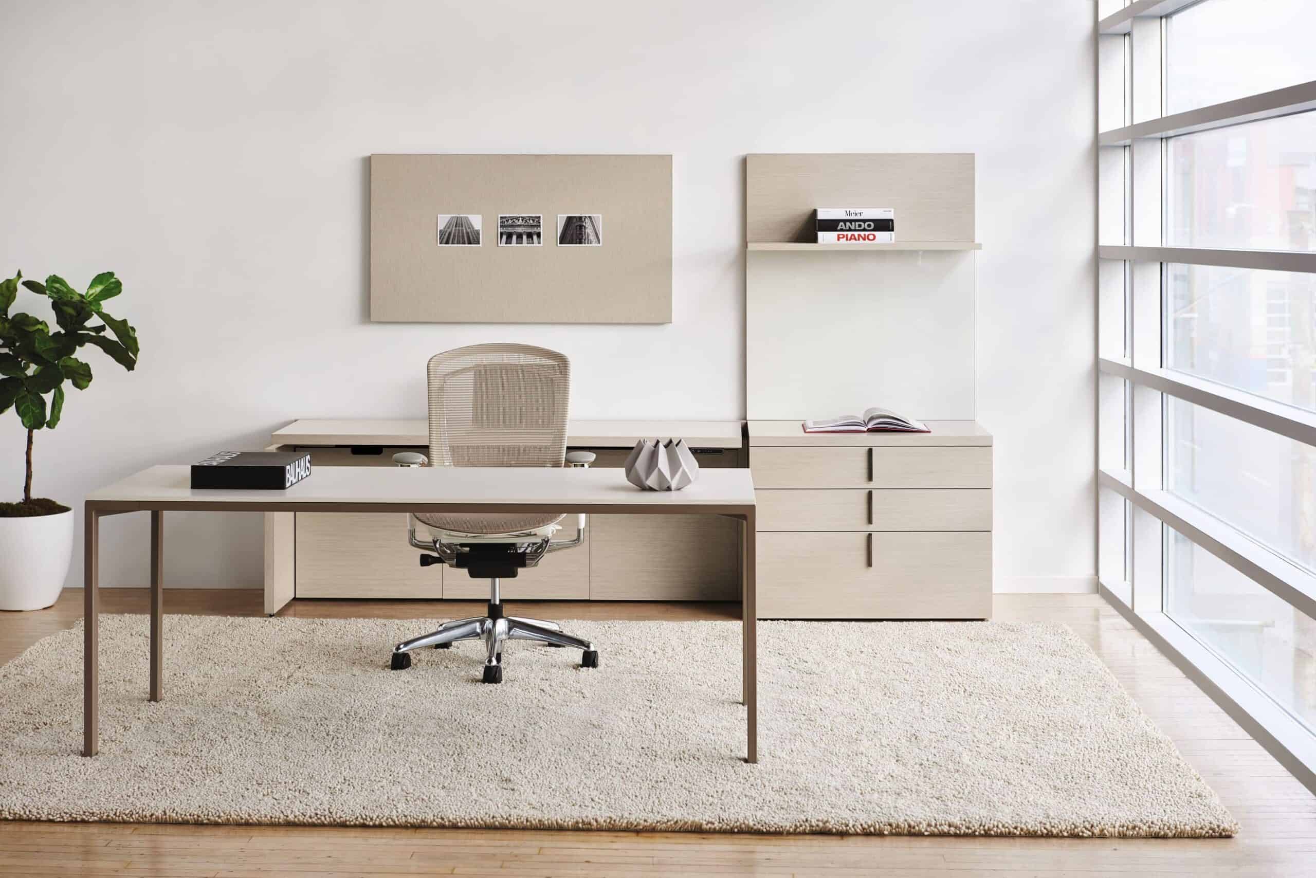
Inviting Neutrals
White can have a clinical feel, so it may be best to go with off-white for a softer, welcoming vibe. It adds a sense of purity and clarity to spaces while serving as a canvas for brighter colors. Too much gray can stir feelings of melancholy, but using subtle shades creates a clean, neutral backdrop for mind-stimulating colors like blue and green. Brown’s warm feel makes it a great balance for more energizing colors like yellow and orange.
When choosing the best colors for your workplace, it’s important to consider how your employees use different areas of the office and what they need to produce their best work. For example, does the space they are using encourage collaboration, or is it more conducive for intense focus? You can use different colors to separate areas throughout the workplace or create the vibe you want in each setting. Also, consider the lighting. Using darker shades in a dark space can be a productivity killer, while bright hues in an area with lots of light can be blinding. And make sure the colors you pick don’t clash with furniture, window frames, and other parts of the room, especially when using bolder colors.
Want more insight on how you can use color in commercial office color schemes to engage and inspire employees? To see how we can renovate your office, contact us today.
Come see these ideas in person!
Book a tour of our showroom for a complimentary design consult.
