
With the New Year here, how about a new look for your office to go with it? Countless studies have shown the effect of color on mood and perception. It’s why you’ll often note distinct color palettes in high-end restaurants versus quick service and fast food restaurants. And why consumer product manufacturers pay excruciating detail to the color choices in their products and packaging. But did you know that color can also have profound effect on the productivity of your employees?
If your office had a case of the blah’s this past year or you’re simply looking for a way to boost energy, creativity and focus going forward, check out these inspirational commercial office color schemes.
The Color Effect
Blue
The vibe: Calming, promotes trust, communication and focus.
Ideal in: Spaces where head down work is needed.
Yellow
The vibe: Optimistic, stimulates the spirit and promotes innovation.
Ideal in: Spaces where creativity is needed.
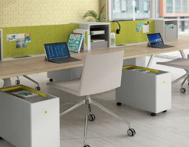
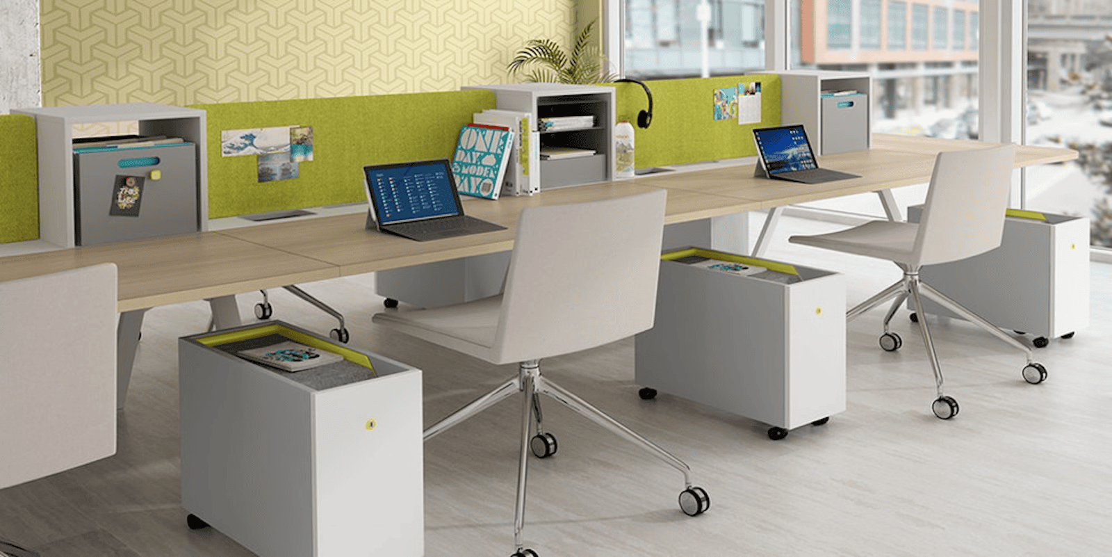
Green
The vibe: Also calming, promotes balance, confidence and efficiency.
Ideal in: Spaces where you brainstorm and/or where employees are working for long periods of time as it does not cause eye fatigue.
Red
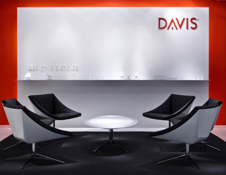
The vibe: Stimulating, active, passionate and intense.
Ideal in: Spaces where detail-oriented tasks are performed or tasks that require memory retrieval and/or physical activity as it increases heart rate and blood flow. Also great in areas where you want to draw attention.
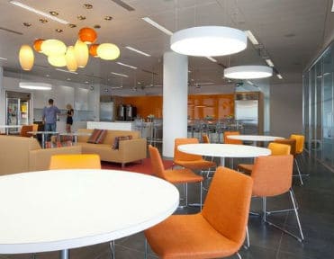
Orange
The vibe: Cheerful and energetic, a playful color with a lot of warmth
Ideal in: Spaces where you’re encouraging employee interaction and engagement such as office break rooms.
Commercial Office Color Scheme Considerations
Keep in mind that there’s no wrong color to use in an office, it’s more about how you use it with considerations such as:
- The Where – It’s not just the vibe of the color, it must make sense for the work being done. For example, conference rooms, reception and HR spaces may need different color schemes.
- The Who – Make sure to consider who will be working in the space. For example, studies have shown that gray, beige and white offices may create feelings sadness and depression, especially in women, while men may experience these feelings in purple and orange workspaces.
- The Who Part Deux – If you have clients visit your office, color use is a way that you can bring your culture and brand into the space so consider what message and feel you want to convey to them as well.
- The How – There’s more to a color than the color itself so to speak. By that we mean, don’t rule out a color because it’s too bright, for example. You can always adjust the saturation until the color is the ideal hue for the space.
Not All or Nothing
The pressure’s off, you don’t have to find the one color that’s best for your space. In fact, colors work best when surrounded by other colors. So, it’s really about choosing the right combination of colors to increase productivity using the considerations above.
Here’s some inspiration:
- Use blues in a conference room to calm the nerves of presenters with a pop of yellow to accent as studies show yellow helps you retain information.
- Light yellow walls with a purple accent wall can give a space energy without going overboard, particularly if there’s a lot of natural light already.
- Gray is a good accent color to anchor a brightly-colored space.
- And if you’re a stickler for consistency, blue may work for all the office walls then use other colors as accents in desks, chairs, artwork and so on.
Which brings us to what could be the most important point of all: color is not just about the paint on the walls. To be most effective it can (and should) be used in your furniture and accessory choices as well.
Whatever you choose, have fun with it and don’t be afraid to be bold!
Like What You See Here?
We can do the same for you with a modern office furniture design. Book a tour of our showroom and enjoy a free design consultation to see how.
[button open_new_tab=”true” color=”accent-color” hover_text_color_override=”#fff” size=”medium” url=”https://team-mates.com/book-a-showroom-tour/” text=”Book a Tour of Our Showroom” color_override=”#ffd000″]
